Future state concept for the scheduling tool.
Every year, Intuit onboards thousands of TurboTax Live experts as seasonal employees. Before they can start helping customers, they need to set up their base schedule—something both the experts and Intuit's staffing team depend on.
A previous team had built a self-service tool, but it was overwhelming. Too much information, confusing instructions, and experts got stuck on what should have been straightforward.
With a new tax season approaching, I led a content redesign of the scheduling tool. My goal: turn a frustrating hurdle into something that helped experts feel ready and confident about their new role.
Team
Intuit, Virtual Expert Platform
Timeline
May 2020 to June 2021
Our content design principles
Give people information exactly when they need it
Break big, complicated tasks into smaller pieces that don't feel intimidating
The expert journey
Experts use the scheduling tool to set their weekly availability across a 12-week period before tax season ends, ensuring adequate coverage while respecting their availability.
After an initial walkthrough, experts schedule their hours week by week—completing all 12 weeks before moving forward. Each week has different hour requirements based on expected demand, making it tricky to navigate. Once complete, experts review their full schedule, make adjustments, and submit.
Laying the groundwork with a content audit
While my PM and interaction design partners dove into specific problems and screens, I stepped back to look at the bigger picture—what story were we telling experts throughout this entire experience?
I put together an audit deck and asked teammates to weigh in. Going through everything with fresh eyes revealed many places where we could make the content work harder.
Audit slides documenting the base schedule creation workflow, compiled from product screenshots, interface strings, design files, and data.
Updating the first-time use experience
Original instructions screen before redesign.
The audit showed the onboarding screen had real problems. Beyond too many scheduling rules, the whole thing was a mess—no headings, no visual hierarchy, just a wall of text. We were asking experts to read and remember everything at once.
Redesigned instructions screen (first iteration) featuring clear headings and logical information grouping.
My first try focused on clear headings and breaking up information into logical chunks. But I still had too much content.
We put this version in front of experts, and they found it easier to scan and understand than the original—but we knew we could do better.
Refined instructions screen with reduced content to minimize information overload.
After working with the visual design team, we got much more aggressive about cutting content to reduce overwhelming experts.
Before launching, we made calls about what really needed to be on this screen. Working with stakeholders, we kept only the essentials and moved the rest to places where it would be more helpful—like right when experts actually need that information.
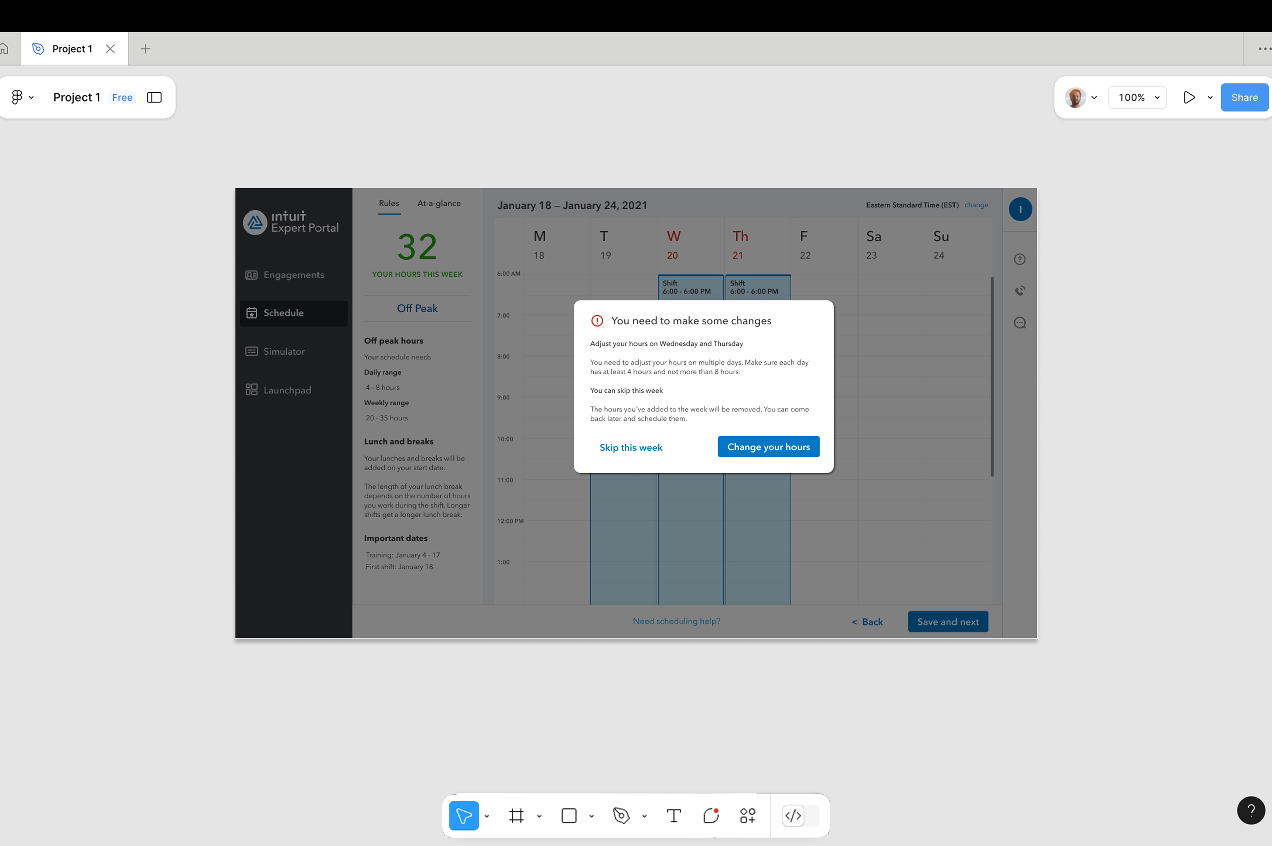
Future state concept for the scheduling tool.
Even after launch, my visual design partner and I kept refining the experience. This concept shows where we think it could go next—tighter headline, clearer hierarchy, and help that shows up exactly when experts need it.
Creating helpful error messages
Error message comparison showing original version (left) and first iteration (right).
The audit showed our error messages didn't help. They'd tell experts something was wrong but not how to fix it. Like "Your hours don't meet requirements"—okay, but what requirements? What should I change?
I pushed for a different approach: error messages should help people solve the problem, not just point it out.
Working spreadsheet documenting error message audit and revisions.
I worked with engineering to map out every possible error and talked with product managers about what was technically possible. Going through this, I realized something important—many errors could be avoided completely with better guidance upfront.
First iteration of the redesigned error message with directive information.
For errors we couldn't prevent, we wrote messages that told experts exactly what to do. Each one starts with the action they need to take. But we wondered if that was enough.
Launched error message that accounts for unseen use cases while providing schedule approval guidance.
We know life happens—childcare falls through, someone gets sick, plans change. So we launched with messaging that acknowledged experts might need to skip a week and come back later. We wanted to be realistic about how people actually work while meeting our business needs.
In-product guidance
Original weekly scheduling interface.
The original interface threw way too much information at experts all at once. A lot of it—especially the long introductory text—would work better in an email or during training, not when someone's actually scheduling hours.
First iteration with requirements content moved from instructions screen to scheduling interface.
We made some key changes to fix this:
- Swapped out cold "minimum/maximum" language for friendlier ranges
- Broke down complicated requirements into scannable, actionable chunks
- Moved important information to places where it made more sense to experts
The final design focused on what experts really needed—their scheduled hours front and center—with help available when needed, but not in the way.
Learnings
It's hard to separate how much the content changes helped versus other design improvements, but the overall redesign definitely made things better. Now experts get:
- Clear guidance that tells them what to do
- Information in manageable chunks instead of all at once
- Error messages that help them fix problems instead of just pointing them out
This project reminded me: good content design isn't about writing perfect copy. It's about understanding what people need well enough to know what to tell them, when to tell them, and—maybe most importantly—what to leave out.
The team working on this now has a solid foundation to build from. The approach we took—keeping things clear, contextual, and empowering—is still guiding how the tool evolves.