
Role
Content Designer
Team
Intuit, Virtual Expert Platform
Timeline
May 2020 to June 2021

Timing
Deliver the right message at the right moment to guide users effectively.
Upbeat
Keep the tone friendly and encouraging—celebrate the user’s achievement of landing a new job!
Show the way
Simplify the process—guide users through scheduling without adding unnecessary complexity.

During the audit, I found this screen had several issues. Not only was the scheduling criteria burdensome, the screen was difficult to read. It lacked headlines and structure that made it difficult for someone to scan, read, and comprehend. In addition, we expected them to remember everything, placing an undue cognitive load.

I took a moment to create a scrappy version of this content with the ideas chunked together. When I tested this concept, this screen performed well, as the subheads made the information scannable and easier to comprehend.

Before launching this screen, we cut a lot more copy. I worked with my stakeholders to make sure we included only what the user needed to know at this point.

After the experience launched, I had an opportunity to think about a future state. I tightened up the headline, focused on the hierarchy, and moved messages to other contextually relevant areas of the experience.

During the audit, I found some error messages unhelpful—some just repeated the issue, and hourly ranges lacked specificity.
To improve clarity, I created a quick mockup and discussed with partners the importance of guiding users to resolve errors independently.

Since I was unable to get access to all the errors in my own audit, I worked with my product and engineer partners to pull all the use cases and the existing error messages. After reviewing all the error messages I worked with the team to figure out how we can prevent these errors in the first place.
Once we understood what error messages we needed to keep, I created a messaging pattern and presented my work to my partners.

For unavoidable errors, we tailored specific, actionable messages. In this iteration, we focused on leading users with clear actions to resolve the issue, though we questioned whether the minimal approach was the best solution.
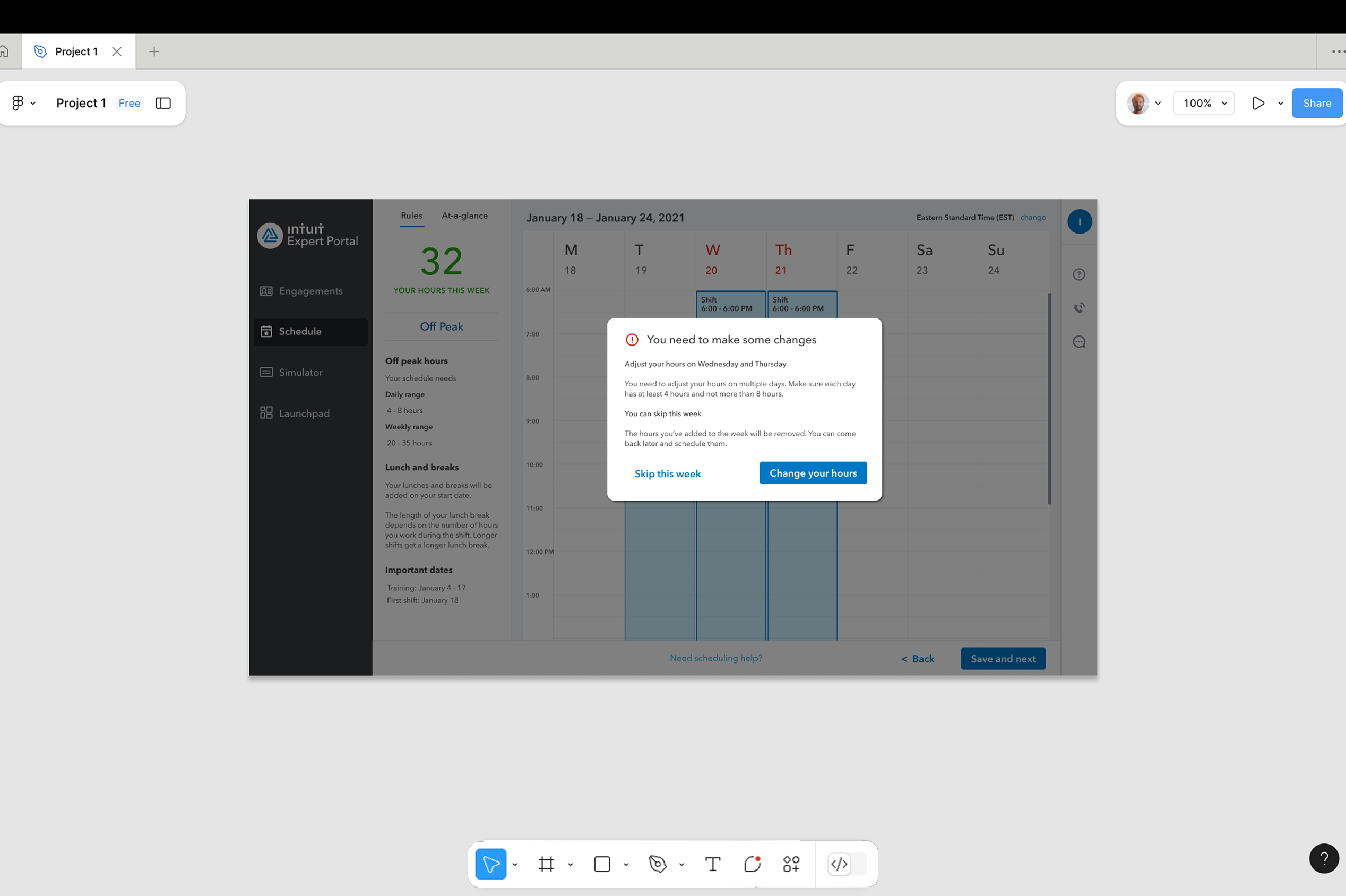
Understanding that personal and unforeseen factors affect scheduling, we launched with a broader headline that allowed for flexibility in error resolution, covering all possible user actions.

